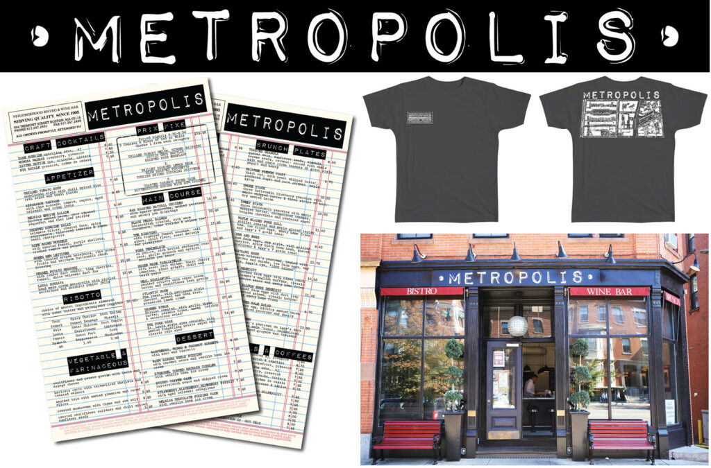
The rebrand of Metropolis focused on logos, signage, menus & uniforms. The inspiration for this project was to embrace their position as one of the oldest restaurants in the neighborhood. Carbon guest checks, label makers and vintage city maps were all part of how this came together. (click image to enlarge)